Our Brand
Jump to: Logos | Entities | Sub Brands | Brand Templates | Wallpapers and Backgrounds | Social Media Toolkits |
True and Constant
Gamma Phi Beta is a distinct brand. Our four Founders gave life and a personality to our Sorority by implementing a mission and vision statement and giving symbols like a crescent moon meaning. We know who we are and what we stand for. That’s our brand identity.
Fast-forward 150 years and the same holds true: we know who we are and what we stand for, and that will never change. Nonetheless, the times do. Our organization has grown exponentially since our four Founders’ era. Subtle updates to our brand have been made throughout the years to maintain our relevance. We built upon our rich history, utilizing iconic symbols of our sisterhood, with new and improved components that position us for our future.
Things will inevitably change with time, but Gamma Phi Beta and our sisterhood will remain true and constant forever. Since day one, we have known who we are and what we stand for. Our hope is that our brand builds upon that sentiment with refinement that will only set us up for success as we continue to grow and evolve as an organization.
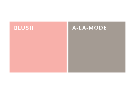
Primary Colors

Secondary Colors

Sub Brands
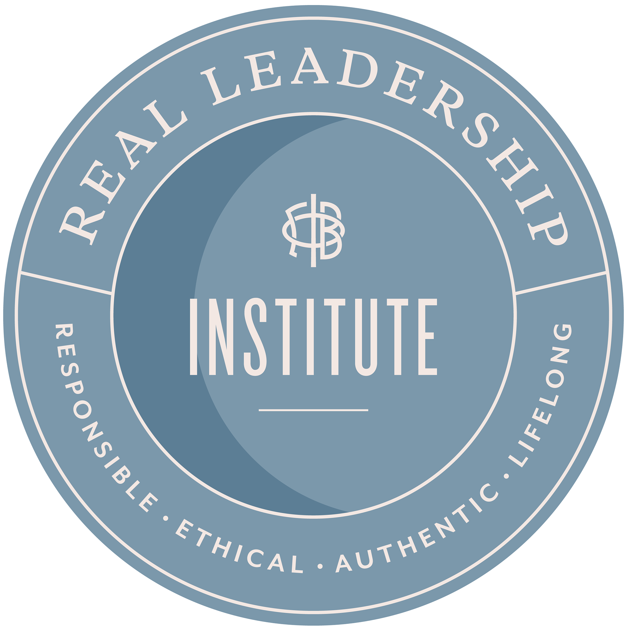
REAL Leadership
Gamma Phi Beta’s leadership and educational initiative, REAL (Responsible, Ethical, Authentic and Lifelong) Leadership, provides sisters with opportunities and resources to develop their leadership skills. The REAL Leadership logomark features the same elements and iconic symbols found in the international brand. The official seal shape was constructed to build unity across programming.


Building Strong Girls
Gamma Phi Beta’s philanthropic focus isn’t simply addressing an existing challenge, but instead, is proactively working to build strong girls by providing opportunities for long-term success and inspiration for the female leaders of tomorrow.
In the logomark, the word “Strong” is bolded, emphasizing our commitment to Building Strong Girls. Additionally, our signature crescent acts as the dot above “i” in “girls,” unifying this mark to our international brand.

Moonball
Moonball is our signature philanthropy event that supports our philanthropic partner, Girls on the Run International. Several crescent moons form the first “o” in “moon,” which indicates its relationship to our Building Strong Girls logo and creates an interesting visual component overall.


